LAHORE (PRESS RELEASE)
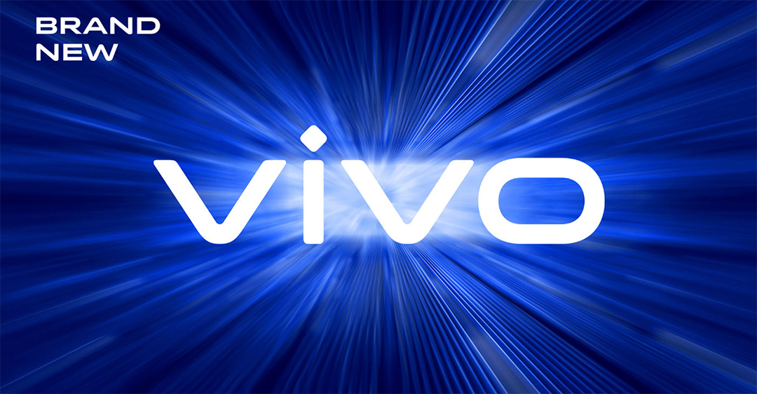
Vivo has recently unveiled its new visual brand identity to signify the company’s innovation and appeal to the global audience. The new visual identity includes a new company logo, a unique Vivo brand color exclusive Vivo fonts.
“Vivo has evolved from a follower to a leader in the tech and lifestyle industry.” said Spark Ni, Senior Vice President of Vivo. “Through the new branding, we hope to redefine the brand’s positioning in technology and innovation and express our brand vision of ‘enjoying the extraordinary’ with young consumers around the world with unique visuals and creative spirit.”
Vivo partnered with renowned designer Bo Linnemann to design the new logo. The new logo features simplified lines and sharpened angles to reflect the forward-looking spirit of Vivo.
The Vivo logo is revamped to reflect the energetic and futuristic brand character
The company has also revamped its “Vivo Blue” color by using a more saturated shade of blue as a result of a study by Vivo to better understand consumer visual habits and their visual receptiveness to digital displays. The new color is deemed more soothing to the eye and the color is the ideal visual backdrop for the company’s creative and expressive character.
The new fonts for English and Chinese are designed by Bo Linnemann and award-winning Chinese calligrapher Qiu Yin.
The official Vivo Blue color is more saturated and designed to be soothing to the eye
“Vivo is not only an industry leader in the smartphone technology, but also a brand that is willing and genuine in its communications with consumers. Building on Vivo’s strong international visibility and influence, this new visual brand identity will better channel the brand’s character and attractiveness.” said Bo Linnemann, Contributing Designer to Vivo’s branding project.
The new branding will be updated to VI systems and rolled out to communication channels with immediate effect.

